Sunday, November 10, 2013

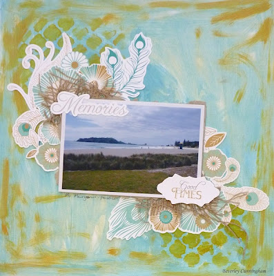
I have created finally and its a double layout

Yes the drought of mojo is still around but I have done two layouts this week and one I am showing today is a double!


Lots of different products - my minds eye and Kaisercraft papers, flairs, enamel dots, twine, chipboard, dylusion spray and wood veneers.


I am entering the right hand side one into the Kraft it up challenge this month which is to use one of these products (I have used them all):
Enamel dots
Wood Veneers or
Flairs

Hopefully I will create some more soon!

Sunday, September 29, 2013

Guest Design Team spot

This month I have been the guest designer and here is the remainder of my projects.
First project for the day using the gorgeous collection by Kaisercraft called Curiosity. I have gone for a more mixed media approach this week and created a cover for my Zutter 8 x 8 album.
 Here is the finished project:


I started out with the album cover from Zutter.  Inside it has a pocket to slip your bound zutter album in - it also has a clear page in to slip in the pocket once it has been attached to the rest of the album you make for the cover. The cover just adds more to a bound album and covers the wire when on display.

I then painted the album using a brown paint dauber to create a fake woodgrain effect.
You could use a distress paint by Tim Holtz for this and add more effects by using more then one colour and spritzing with water.


The next step was using a Crafters Workshop Brick Mask and Moulding Paste to create some texture to my album cover.  I then sprayed the cover with some mists made with various colours of Perfect Pearl Powders, Distress Ink Reinkers and water.


I then embellished the cover with the following:
 Kaisercraft Curiosity collectibles

Here are some closeups.  as you can see I have cut up the diecuts from the couture creation die using American crafts cardstock. This die cuts beautifully!


My next project is a few mini layouts to share.  These layouts are 8 x 8 inch layouts perfect for the Zutter 8 x 8 protective pockets that are pre-punched. I find that a great starting point for doing layouts is finding sketch sites - Creative Scrappers is one of my favourites. There are heaps of sketches on their site.
When I first received my kit and this collection I thought cool I would do lots of embellishing with it but once I worked with it I decided it needed a less is more approach because of the big prints and bold colours. My layouts do not have any photos on at this stage as I have not decided what photos to use yet.  When doing a mini album without photos just attach all embellishments and paper in such a way that they can be added later.
Each mini layout has been sprayed with Dylusions White Linen and the edges inked with white ink.

I have created four layouts so far with the Curiosity collection mainly using the 6 x 6 pad , a few of the collectables and some stickers. On some of the images I have added glossy accents  to give more dimension or added foam squares. I have used cardstock for the base and photo mats.

With my first mini layout I added a bit of jute string for interest and extra dimension.


My second mini layout has space for a bigger photo and I have clustered the strawberry collectables down the side of the layout.


The third mini layout has fussy cutting, a bit of paper tearing and a mini banner to balance it out.


The fourth mini layout incorporates the popular banner trend that has occurred in the scrapping world in the last couple of years and looks like it is here to stay for a few more!

 Thank you so much for visiting my blog today


Sunday, September 15, 2013

Miss Gorgeous

Hi everyone yes its been awhile!
I am the guest designer for the month Over At Scottie Crafts and I received the gorgeous Curiosity Collection by Kaisercraft to play with. This is a stunning collection filled with birds, flowers and geometric patterns on the "b"side of the papers. The papers lend themselves to fussy cutting with big images with lovely backgrounds.

Here is a layout I created using the papers, collectibles and stickers in the range. 


A very easy layout with fussy cutting of a couple of the papers - adding a few of the collectables and stickers. The word strip is the cut off strip of one of the papers. If you prefer not to fussy cut the collectables pack and stickers have all the work done for you.

  I have used the Martha Stewart Bubble Bath around the punch set for the paper under the photo. The edges of the layout have been distressed using a Prima distress tool.

Here are some close ups:


Saturday, July 20, 2013

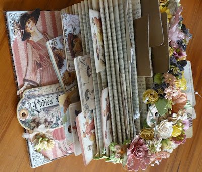
Another open book project Inspired by Wendy

Here is another open book project inspired by Wendy.
This time I used a lot of product rather than using tools.  So heaps a Prima Flowers and Graphic 45 Ladies Diary Collection. I still have to decide what will go on the ATC cards.

Enjoy!!


Friday, July 19, 2013

My project from Wendys SENZ class

Wendy created an awesome open book project for her SENZ Class at Scottie Crafts which I had a go at - it still needs photos and other things added but here it is - Thanks Wendy for being so inspiring!!


My next post will show you a similiar book I created earlier this year when Wendy showed me what she was doing and I was yet again inspired to create quite a different one with a TON of flowers!
 

Thursday, July 18, 2013

Simple Stories Vintage Bliss Snap Album

I have also been creating this snap album over the last few weeks using Simple Stories Vintage Bliss Collection that I got at Scottie Crafts. This collection is gorgeous!

Another slideshow with help from he who should not be named!


Wednesday, July 17, 2013

WHERE HAVE I BEEN!!! and a project that has taken a long time.

Apologies for not posting for TWO months. Been very busy with family, moving my scrap room, SENZ and a little creating.  Also been having a play with my new toy but not creating much with it yet! I am so going to enjoy using it - I have also splurged and bought the designer edition software last week which was half price....


Now onto a project I started at a Rachel Tucker class last year at Autumn escape April 2012.  It was a smash book with fancy pants papers and embellishment which I added a whole lot of bits and leftover scraps to.  It only took 15 months! So glad it is no longer a ufo!


My first video with lots of help from my awesome son who does not want to be named!

Thursday, May 16, 2013

More Kaisercraft Summer Breeze Inspiration

My third layout I created using the Summer Breeze collection shows how well these papers go with beach photos. I inked the white cardstock randomly using a Broken China Distress ink pad.


I have used the Sprout, Entwine and Grow papers along with the stickers and collectables. I have also used My Minds Eye Enamel Dots and some awesome washi tape as well.

Wednesday, May 15, 2013

Scottie Crafts Kaisercraft Summer Breeze inspiration Part Two

The next layout I created with the Summer Breeze collection was even more fun. I created my background with Distress paints again!  I used wild honey, picked raspberry, broken china, peeled paint and mustard seed randomly on white cardstock and spritzed with water.  I then held the paper up to make the paint run.


I have used the following papers in the collection: Sunny and Sprout along with the collectables and stickers.

Tuesday, May 14, 2013

Kaisercraft Summer Breeze Inspiration part One

I received the Kaisercraft Summer Breeze as my Design Team pack and have had some fun creating with it. 

The first layout I created was one using the Sunny 12 by 12 paper. The design just made me want to do a grid like layout.


I have also used the Summer Breeze Collectables and stickers on the layout. the centre of the flowers are Enamel dots by my minds eye - these are really cool! The Dots are using a snow pen but stitching would also work.

Saturday, April 20, 2013

Docrafts Gorjuss Range Insipration

I was really looking forward to the Gorjuss stamps with the current docrafts available.  I have now bought a few sets. The packaging is beautiful so it inspired me to do the following layout.  All the "papers" you can see is actually the packaging from one of the sets. I stamped the little girl and coloured her with distress markers. I have also used the washi tape, bows and buttons from the same range.


Thursday, April 18, 2013

Scrapfest Recipe Challenge

Scrapfest NZ is having a recipe challenge which I decided to participate in.  I am so looking forward to going down to Nelson in August!

Here is the challenge:

"It’s time for another Scrapfest challenge and this time it’s all about the product. We have a little ‘game’ where whoever would like to take part is going to use the following ‘receipe’ to create a scrapbooking project. But as with all things, I bet they turn out differently! In fact we’re counting on it. How much fun will it be to see all the different takes on the same receipe?!

Once you’ve created your project be it a card, a layout, something off the page, or whatever you feel inclined to make, just link it up on our facebook page or Lyn's blog or Trina’s blog and we’ll draw a random name out of a hat to win a great little prize..

You have until 26th April to complete and upload your project.

Now here’s the recipe (you must use EVERYTHING on the list):

1 piece of cardstock (any size) -Kraft backing
At least 4 pieces of patterned paper (any size) - Prima Fairy Rhymes times four -two in the background and two for fussy cut images
(so that means you can use any of the above as your base (if a layout) and then use the others pieces in whatever sizes you want to create part of the design)
At least 5 flowers - Prima flowers
A piece of thread/string/ribbon - twine
Some texture paste - plastered on the background!
Some paint/spray - distress paints covering the texture paste
A tag (any size) - tag I love you to the stars and back
Something sparkly - prima bling
And 4 photos - Katie ready for the ball

Here is my layout:


Thursday, April 11, 2013

Prima April BAP

The sketch this month at the Prima blog just screamed out at me to use the engraver collection and Tim Holtz paints!


April 2013 BAP Lene


I created my background by dabbing the paints and then spritzing with water and letting the paint run! So much fun....The splatters are just from a distress ink reinker.


Prima April PPP Challenge

The Prima Palette this months relates to springtime in the northern hemisphere so a girly layout from me this month!

 2013 April PPP

Here is my layout I have been inspired by the pictures and the colour chart.


Kaitlyn being cute!

Thursday, April 4, 2013

Making your own scrapbooking Background

 I hope you all had a great Easter break and looking forward to another weekend coming up. We have had a bit of rain in Auckland so hopefully some off you who really need it have had some too.
We had a not well timed leaky hot water cylinder on the Saturday night and it was only replaced today - we could only turn on the water for short periods of time as well as it would still leak!


I have been having a play with Tim Holtz Distress Paints and created my own background on this layout. I loooovvveee these paints!!! (confession time I have brought all the available colours oooh but I have seen the new metallic ones and they look awesome!)


I used the following paints along with a Prima Grungy lattice stencil to create the background : Broken China, Bundled Sage and Wild Honey.

Firstly I dabbed a combo of the Bundled Sage and Broken China through the stencil onto white cardstock - this did not work so well so I ran both of the colours randomly all over the cardstock.
My next step was to let it dry.  I then used the Wild Honey paint through the stencil and some random swipes on the edges of the cardstock.

I finished the layout with some hessian fabric and Kaisercraft Elegance collection collectables along with a photo mounted on chipboard for a bit of dimension.

Thanks for looking!

Friday, March 22, 2013

A Canvas for the Scrapfest Hop

In just five months time I am off to Scrapfest in Nelson to enjoy a awesome weekend. Today we are having a blog hop for Scrapfest.

Wednesday night I had fun playing with the new Tim Holtz distress paints and created a canvas. The canvas also has other favourites like Prima and chipboard.  The new wooden embellishments from Prima are so cute and the paints work nicely on them. I have used the Prima Divine collection on the canvas.


I would love you to leave a comment by the end of the 31st of March and you will go into the draw for a scrapping RAK. Enjoy the hop.

Next blog to hop to is Esther's (just click on the link below):

Thursday, March 21, 2013

March Prima BAP and PPP

Just a quick share of my layouts for the Prima March contests.

Here is my layout for the BAP - bright colours of Doodle Duex and Roadtrip against a stark black!


And the greens for St Paddys day for the PPP.


Thursday, February 28, 2013

Prima Product Pick for February

The Prima Product pick for this month was pink,purple, beige and red hues:

2013 Feb PPP 

This is the layout I created using Hello Pastel paper, flowers, bling and some new wooden embellishments.


Sunday, February 24, 2013

Prima BAP for February

Here is Prima's February BAP:

MN sketch 3

 
Here is my layout using the new Lifetime Collection which is one of my favourites and is avilable at Scottie Crafts now. I love the new wooden embellishments too.


Thursday, February 14, 2013

Once upon a sketch Challenge February

Yes another post today - most activity my blog has seen for a while! Thursdays are normally my day off and I have not been scrapping as much as I would like so the housework can wait!

 Once Upon a Sketch challenge theme this month is love with this quote (which I have used in my journalling):

love.

Here is the sketch to base your project on:


I had a great time with molding paste, paint, gesso, pan pastels and ink.  The paper range I have used is Basic Grey's serenade which is gorgeous (I did cover it up a bit with all the meduims though!). I love how it turned out and it looks heaps better IRL.
The photo on the layout is almost 10 years old!


White with One February challenge

Well the challenge at White with one is to use white and pink and include hearts on your project. This next layout is very different to my last one both of which I did last night. One very grungy and this one with lots of white space.  Here is Katie as a princess about to go to the ball.


My Creative Sketches Janaury sketch

My creative sketches challenge ends today and I had a lot of fun creating a boy layout with the wonderful  7 Dots Studio papers, chipboard and Tim Holtz ideology. Here is the sketch:


My layout is of Brendan last year with his hat and sunnies on looking like a gangster (he even had a nerf gun in his hands!)


Sunday, February 10, 2013

Frosted designs Challenge

Yes four blog posts in one day (the challenges close this week so have to put up my links!)!

The Challenge over at Frosted designs is to use the word love and have at least one heart on your project. My layout is of a rare sight these days with my two youngest cuddling. The layout is using kaisercraft products and prima hearts.


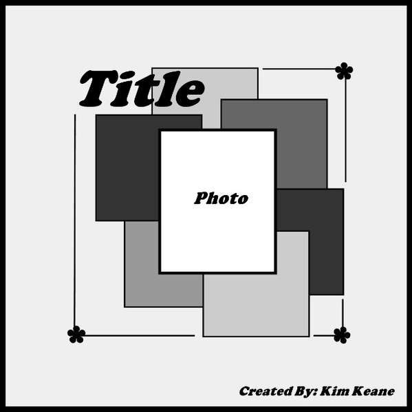
Creative scrappers Sketch Number 246

Another layout I created yesterday was for Creative Scrappers Sketch #246.  I have used some older papers from Bo Bunny called Ad Lib, older photos and look there are no flowers!

A layout of Brendan back in 2002 playing with pegs and not his toys!

CSI challenge Case File no 57

Here is the case file at CSI that ends today:


Here is my layout with Kaitlyn and her new PJs .  My evidence are hearts,flowers and leaves. My testimony is the two perspectives in the photos.


Challenge Me Happy Challenge - White Space

Yesterday I had a crop date with friends and I managed to do three layouts one of which is for the Challenge Me Happy Challenge to create a project with white space.

I used to find this a huge challenge as I love filling my page - I loved doing this layout - my ink splats need work though! I love how the duck looks like it is talking to the sparrows.


Thursday, January 31, 2013

Prima January BAP

My layout I created for Prima's January BAP is a nice bright summery page.  I used sticky embossing powder with microbeads and perfect pearl mists and ink for the background. The layout is mainly using the Zephyr range.